


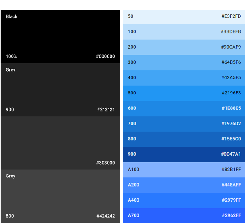
SAMSUNG DESKTOP APP COLOURS
Blue
#1429a0
Dark
#000
White
#FFFFFF
Grey
#303030
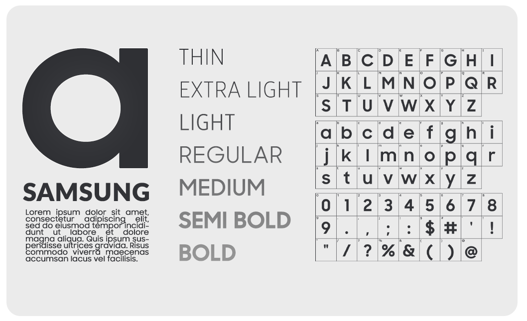
TYPOGRAPHY
Font Family | Samsung
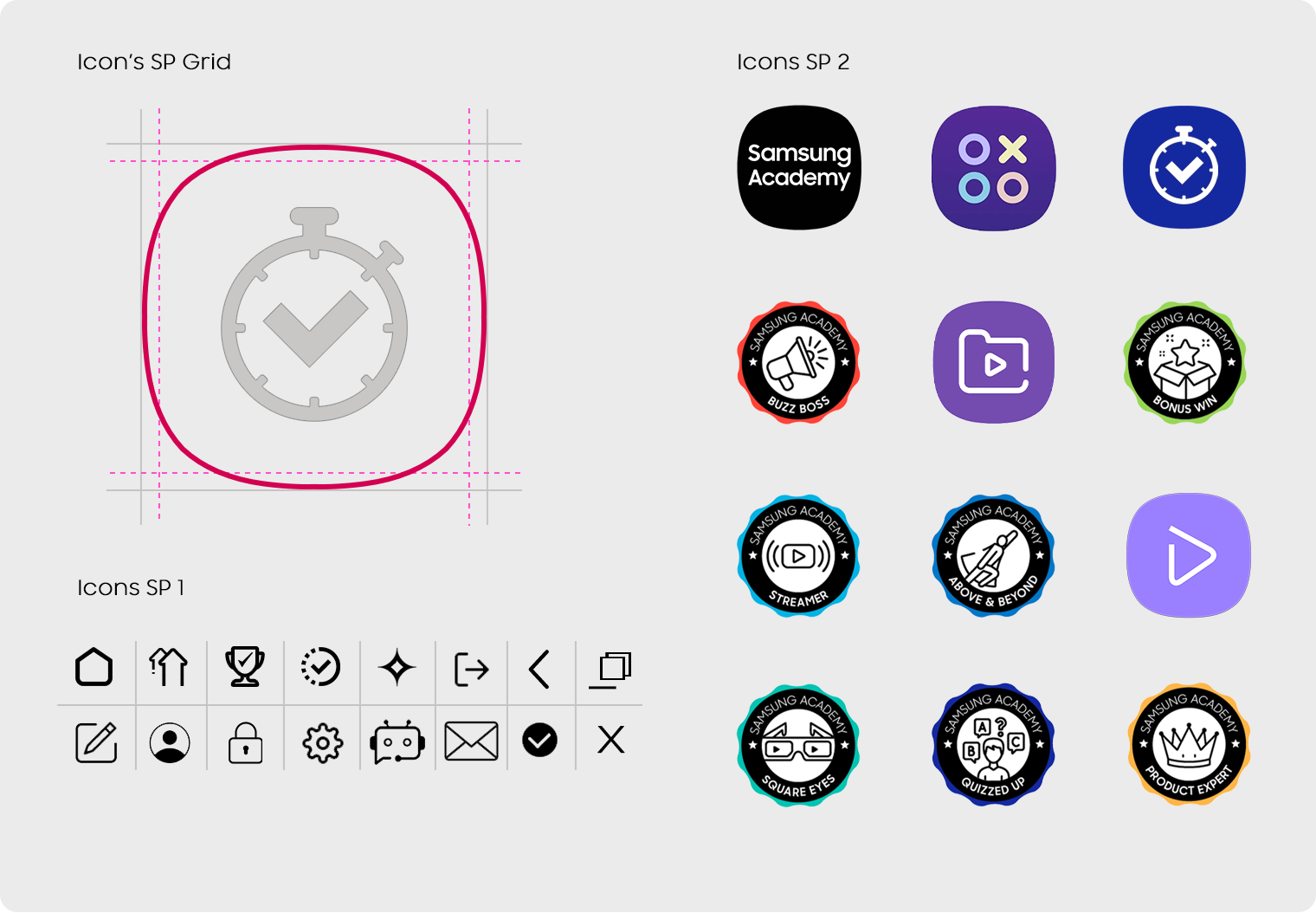
ICONOGRAPHY
Samsung TV app Icons
Logo
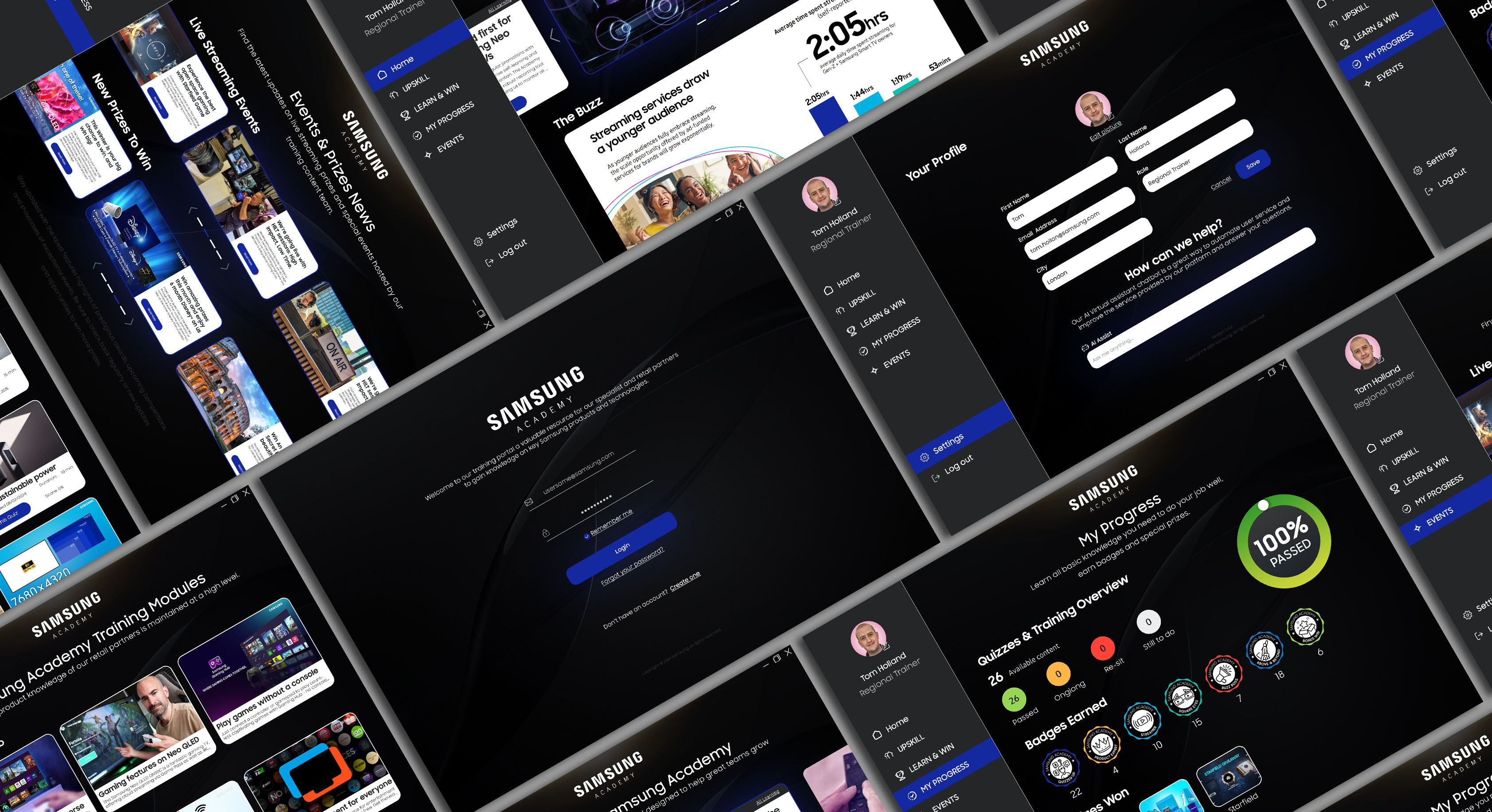
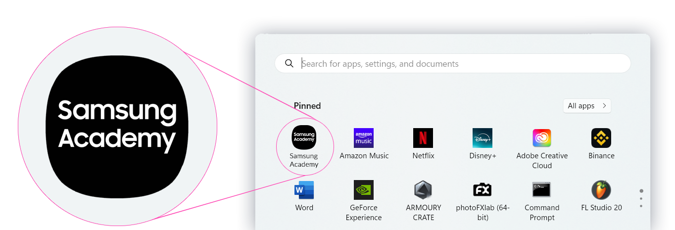
Samsung Academy
DESKTOP APP LOGO
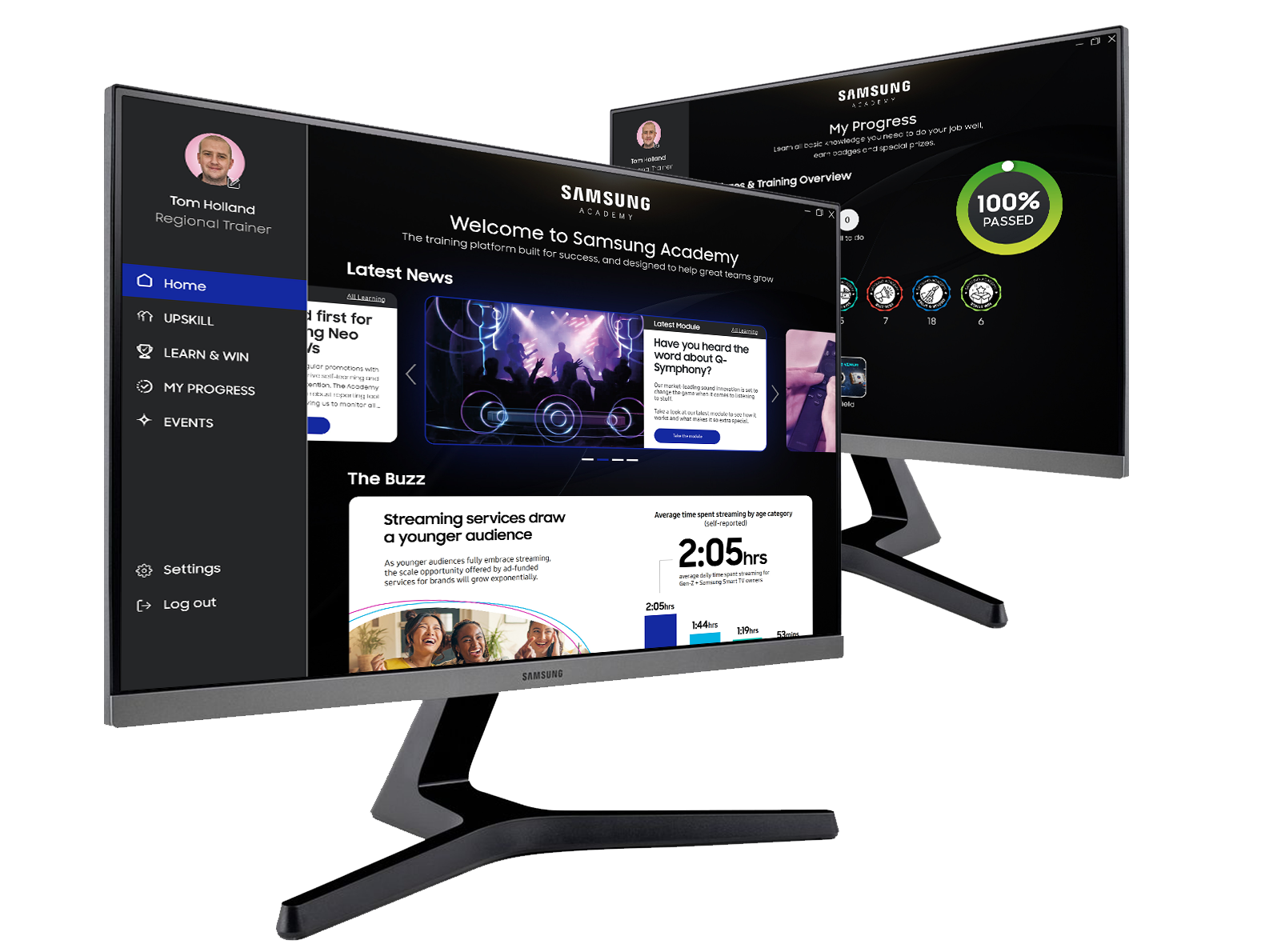
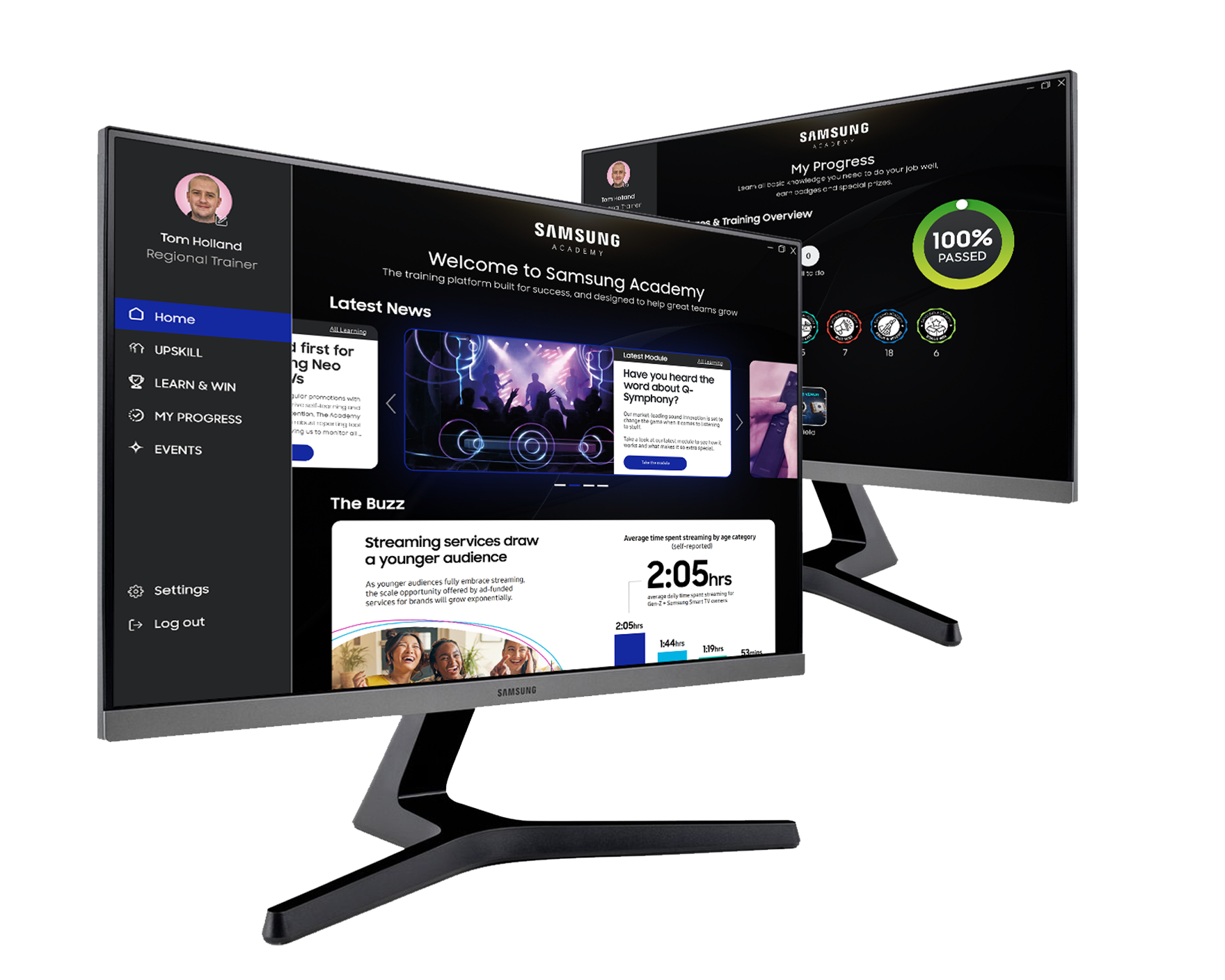
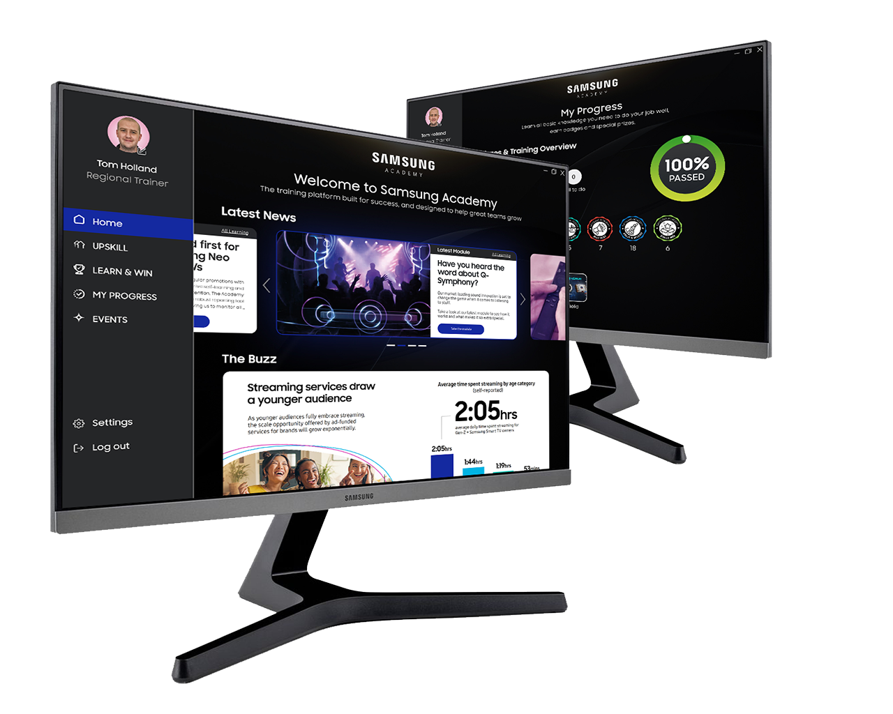
SAMSUNG ACADEMY DESKTOP APP LOGO
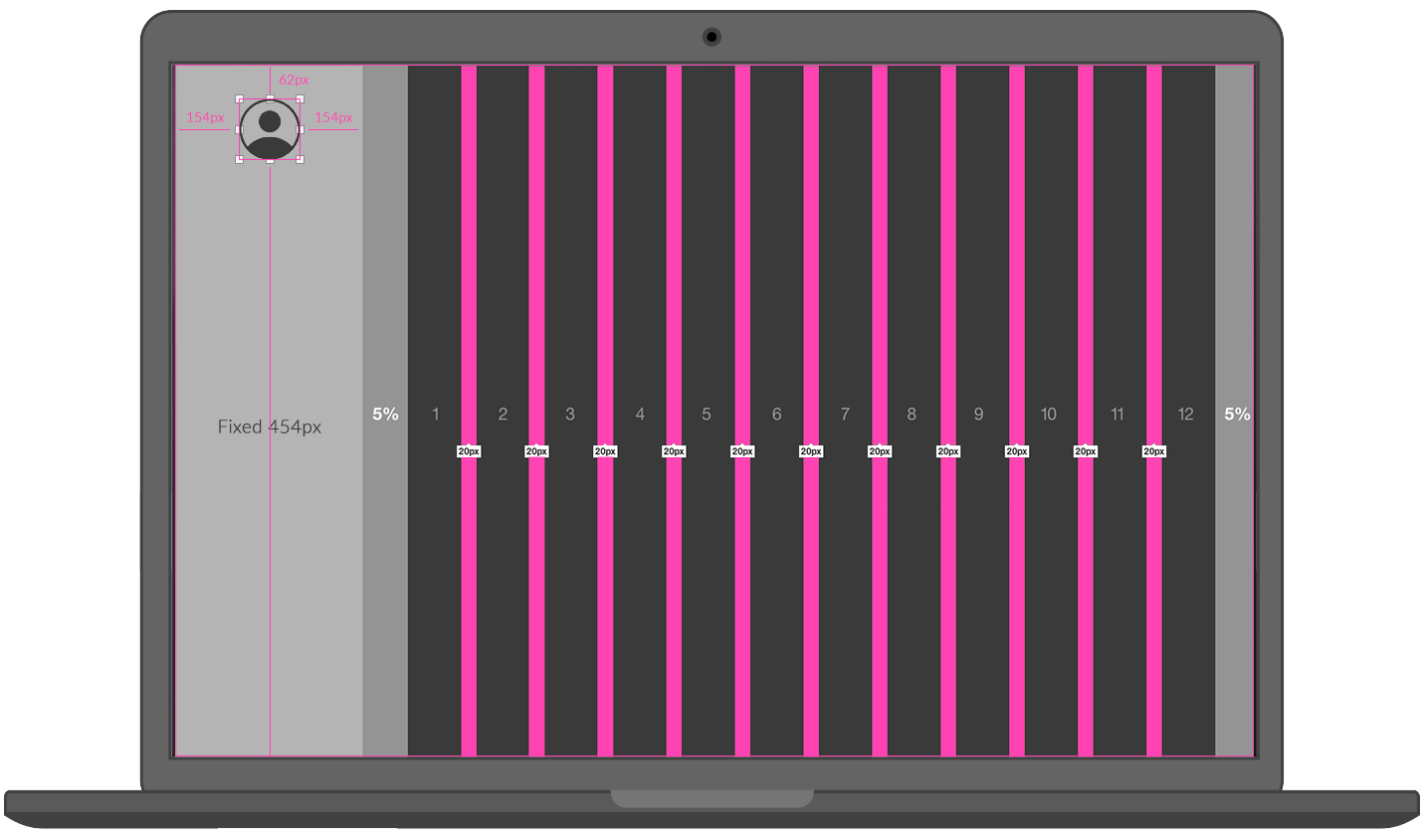
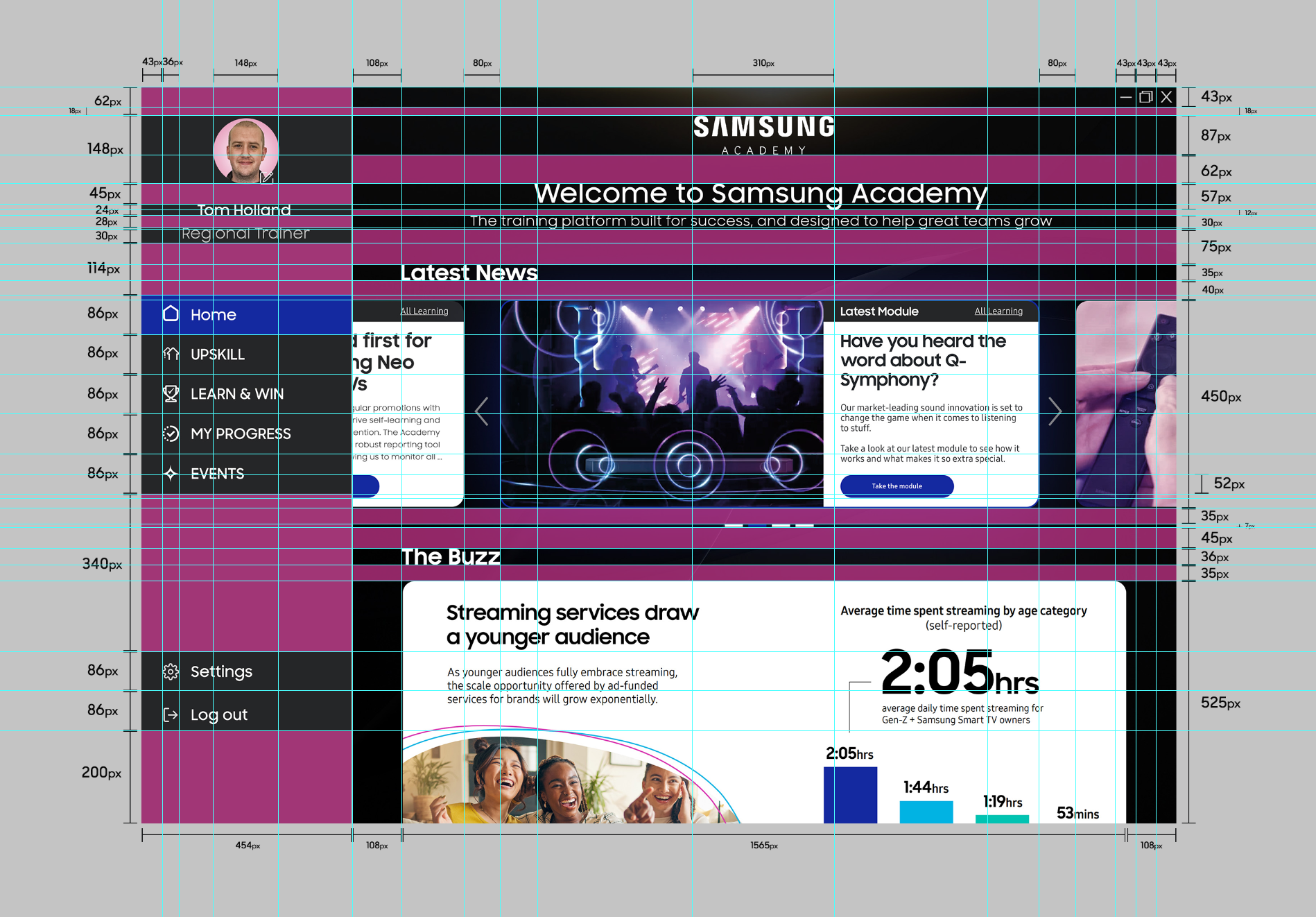
GRID SYSTEM
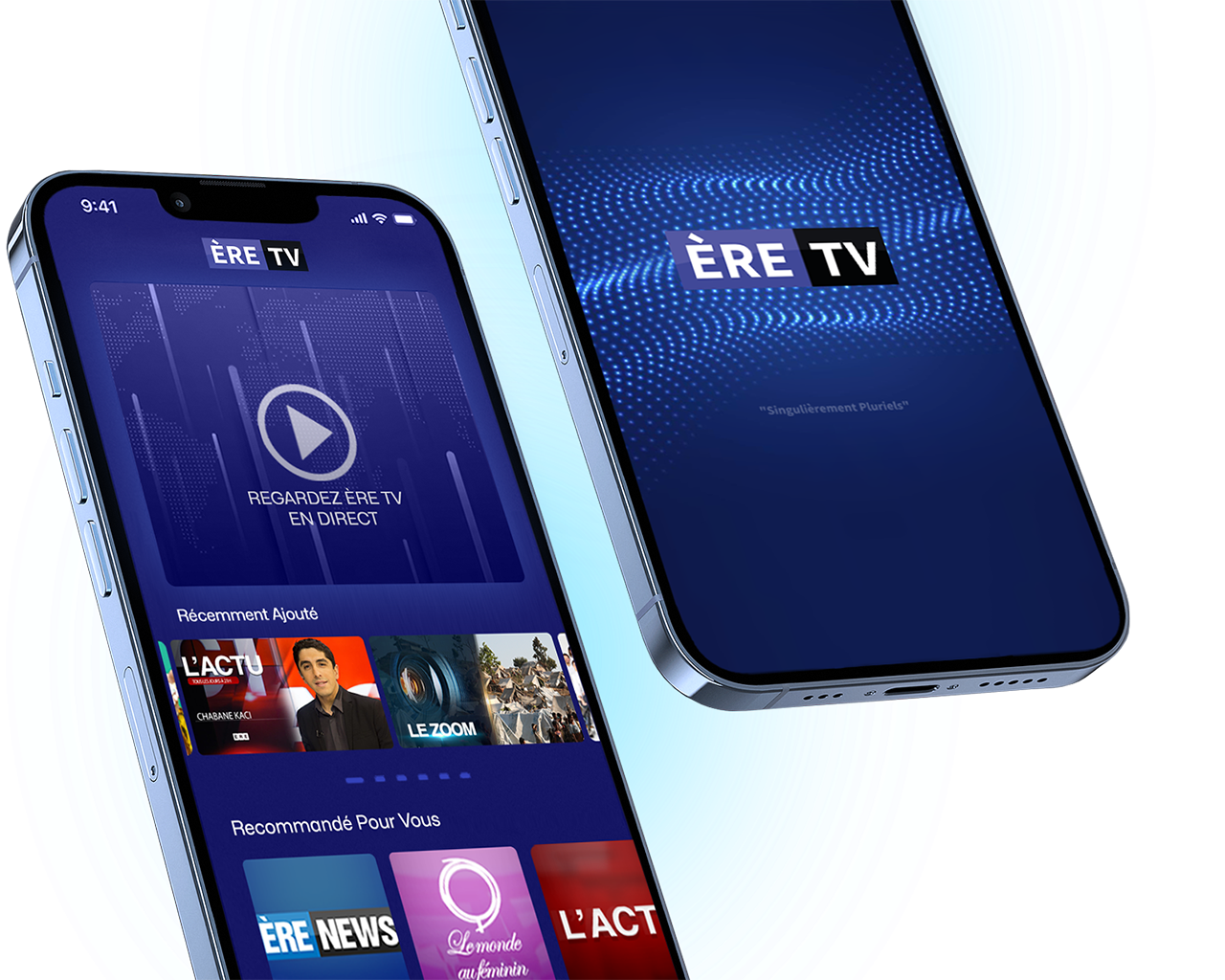
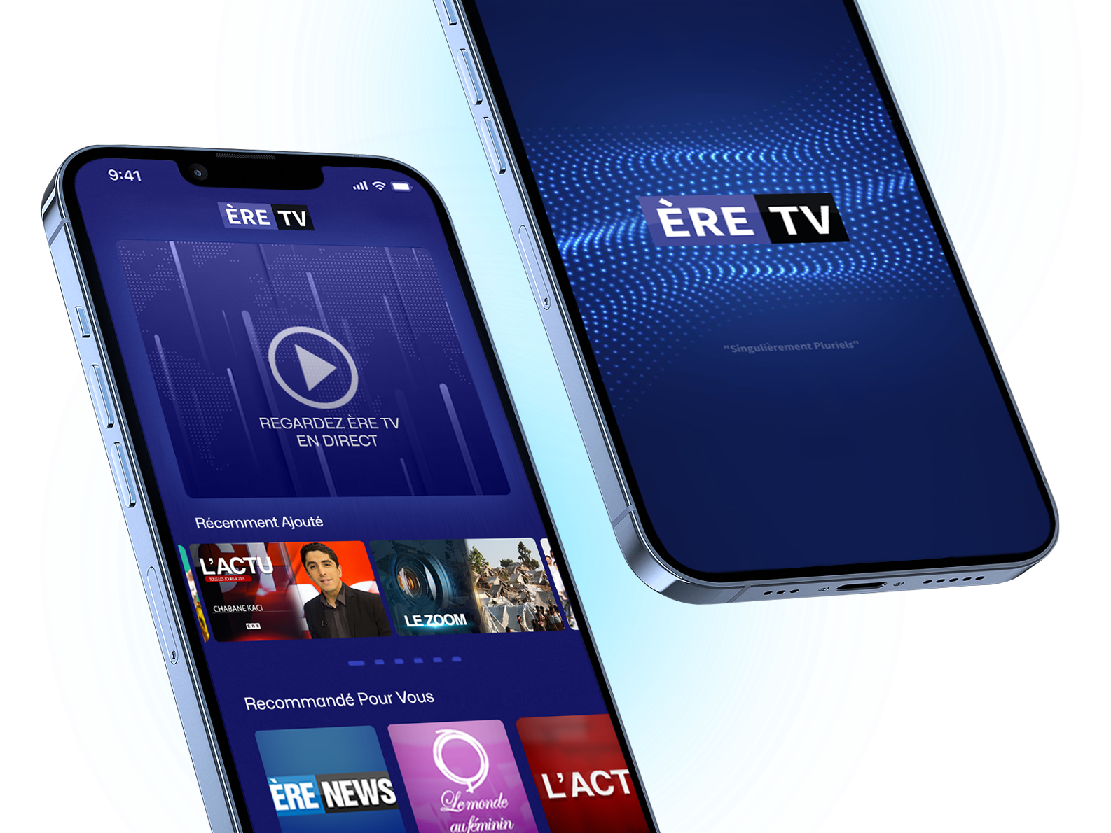
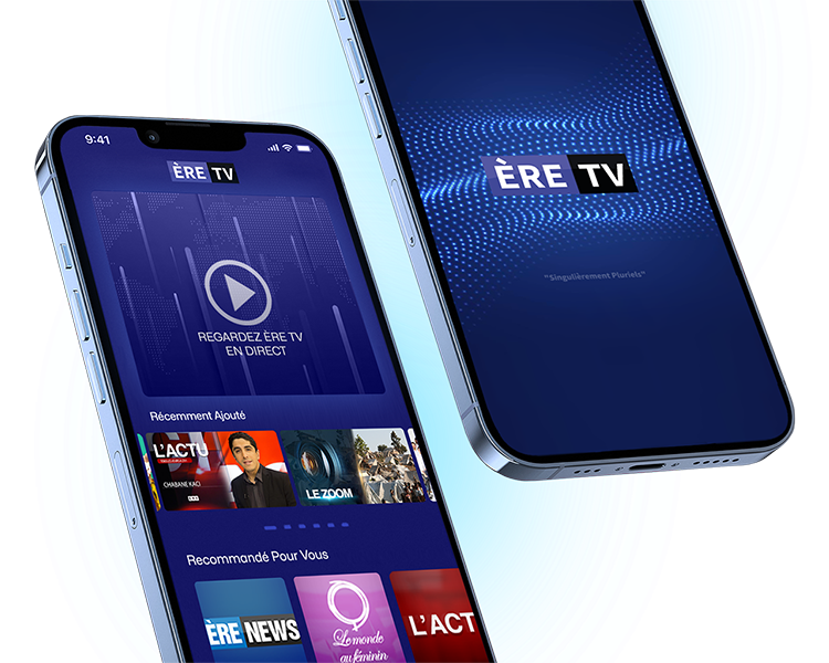
ÈRE TV App Grid